Mail-art by IUOMA member E. Coles (Plymouth, UK)
October 27, 2013 - I was delighted to receive an envelope from (Ms.) E. Coles in Britain containing expressive asemic symbols interacting with subtle textures, thus producing asemic-vispo hybrids familiar to those who have followed the progress of the Martha Stuart School of Asemic Wallpaper. I believe the fluidity and depth-of-field in these compositions is remarkable.
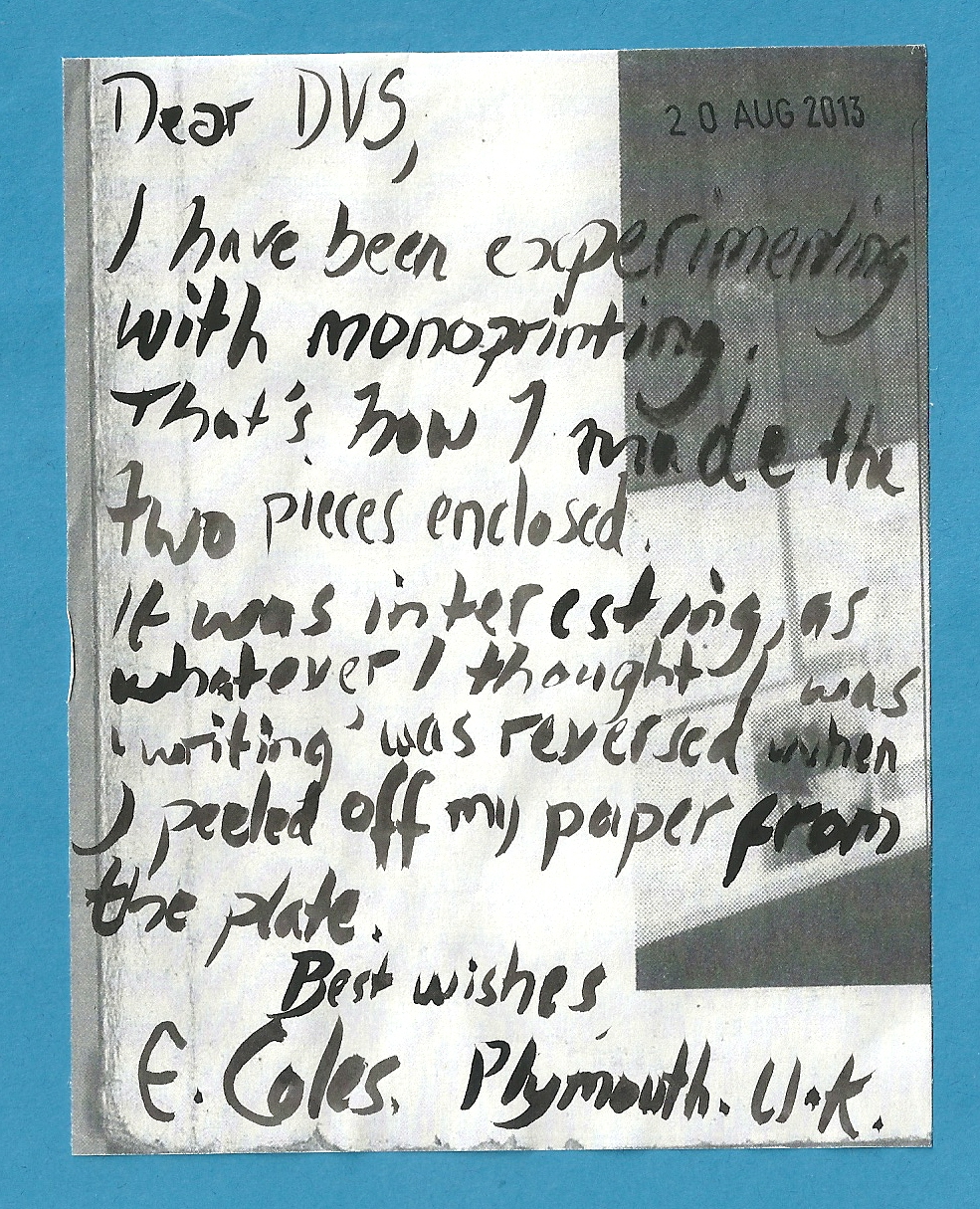
These are done on postcard-size sheets. In terms of typology, E. Coles would appear to favor the asemic glyph. Dear friend Karen Champlin (Illinois, USA) and her pieces with glyphs and complex single symbols come to mind as a comparison; however, E. Coles' work is far more fluid and cursive, suggesting connections rather than the monolithic utterance in the great desert of history: Karen Champlin's work often has an epic quality. E. Coles included a note that sheds some light on her method of composition:
Many, many different approaches can be used in generating asemics. A number of friends, Cheryl Penn (South Africa) comes immediately to mind, have worked with backwards or mirror reversed letters. The monoprinting has produced excellent results for E. Coles in these pieces. Here is the envelope:
The reverse presents a wonderful salute to IUOMA:
Deepest, even if belated, thanks to E. Coles in Britain!
Comment
-
Comment by Theresa Easton on February 17, 2014 at 12:06pm
-
Thanks for the beautifully stitched envelop - inspiring and amazing work! How fantastic - i showed some young people in Hartlepool - they were really impressed thanks
-
Comment by De Villo Sloan on October 30, 2013 at 4:46am
-
Thank you for the lovely work and comments, E. Coles.
I am always fascinated to learn the perspectives of the asemic writers, whether it's John M. Bennett reading chance lines on a concrete floor as asemic or you inspired by specific languages and questions of syntax.
Thanks again
-
Comment by E Coles on October 29, 2013 at 11:59am
-
Thanks for blogging this DVS, and thanks for all your comments.
You are correct that I was inspired by the calligraphy of East Asian languages in the conception of these two pieces (I am a big fan of the Chinese modernist calligrapher Wang Dongling). I also like to work with Arabic inspired forms.
I find that if I try to make a piece of asemic writing in an automatic manner then the usual result is "words" written from left to right made up of "letters" and the result looks like either scribbling or, for some reason, Amharic. I have yet to discover a method of writing in this way which provides pleasing results.
Really, when it comes to putting ink/paint to paper I don't think too much about theory. Mark making (lines and curves) reminiscent of glyphs from different languages is beautiful to me, and that is what I am trying to explore in my pieces.
-
Comment by Nancy Bell Scott on October 28, 2013 at 10:44pm
-
Love the work of E. Coles every time.
-
Comment by De Villo Sloan on October 28, 2013 at 10:39am
-
Thx all!
BG - Japanese calligraphy does seem to have had a big impact on asemic writing and Arabic too. I understand about the wallpaper. Pages of ordinary text aren't necessarily aesthetic & can in fact be boring & repetitive. The same holds true for asemic writing. The addition of other elements - like images - help.
-
Comment by borderlinegrafix on October 28, 2013 at 5:50am
-
DVS - The similarity to Japanese calligraphy and also the Japanese cultures use of rice paper is evident. Also Chinese writing, I suppose. The similarity ends when you realize there is a gulf between E. Coles art and meaning/syntax/language.
Monoprinting is one of a kind; however, the practice of calligraphy, to put on paper, is as much of an action as concrete result of meaning, done over and over again. This is another difference between the two plastic manifestations.
I guess what I am trying to say is that they are indeed wallpaper - but a wallpaper of the mind.
© 2025 Created by Ruud Janssen.
Powered by
![]()


You need to be a member of International Union of Mail-Artists to add comments!
Join International Union of Mail-Artists